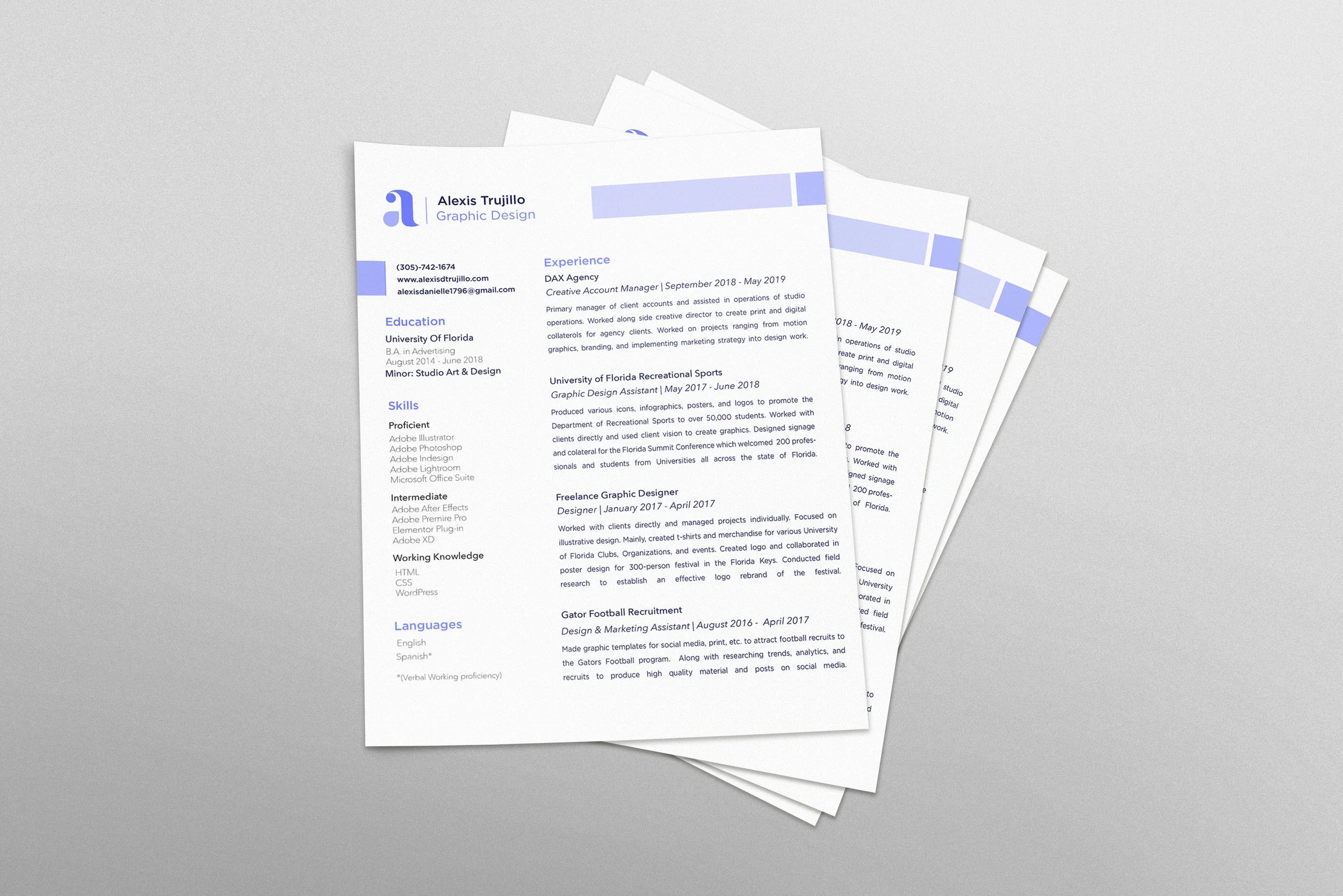
My personal identity is meant to represent me as a graphic designer. Since graduating University, my style as a designer had grown and evolved. It was time for my personal branding to evolve with it.
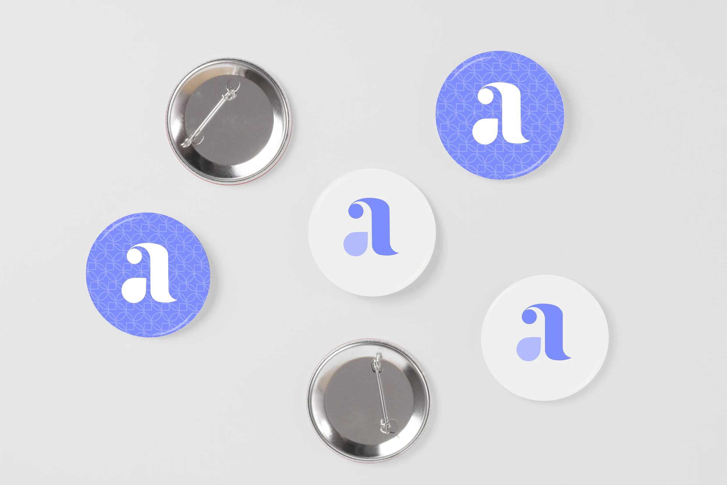
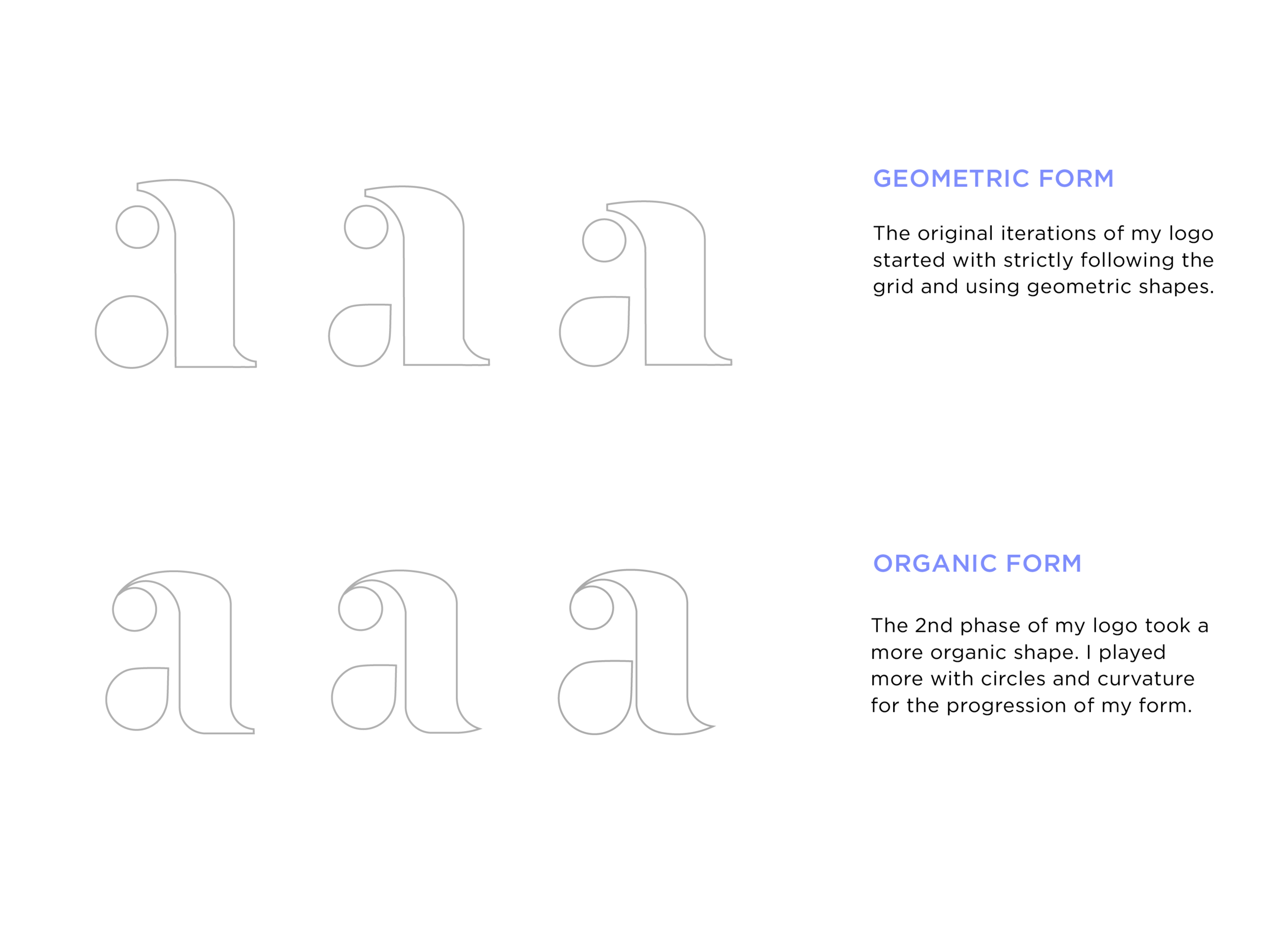
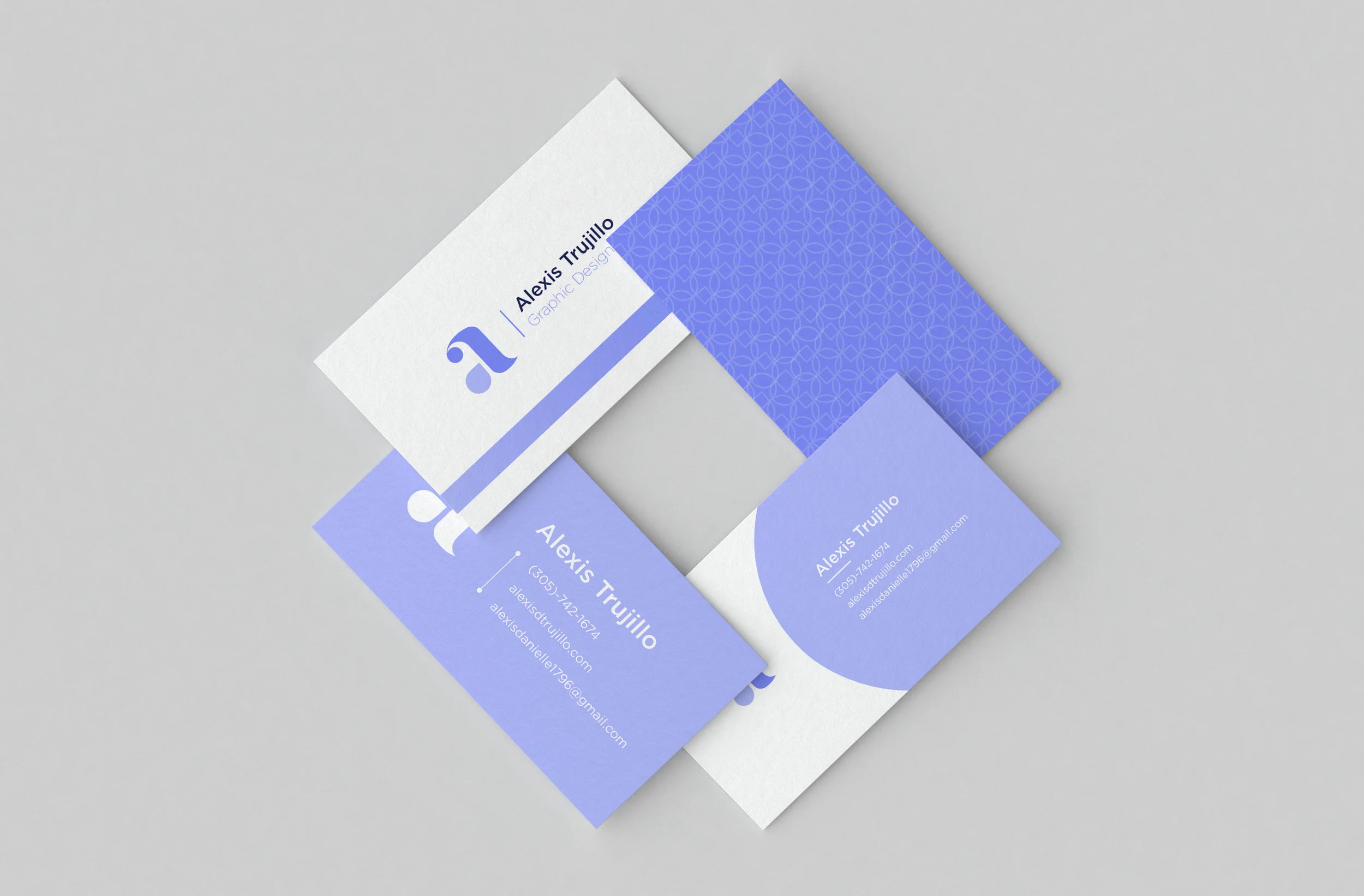
My logo is based off the “A” in Alexis and inspired by the font Baskerville. I created an organic form based off the serif font. My aim was to invoke femininity and whimsy.
Logo Anatomy
This logo was inspired by the curvature of circles. Curved shapes represent movement, pleasure, and generosity. I used the free-flowing movement of the curves to add softness to my geometric logotype
Color Identity
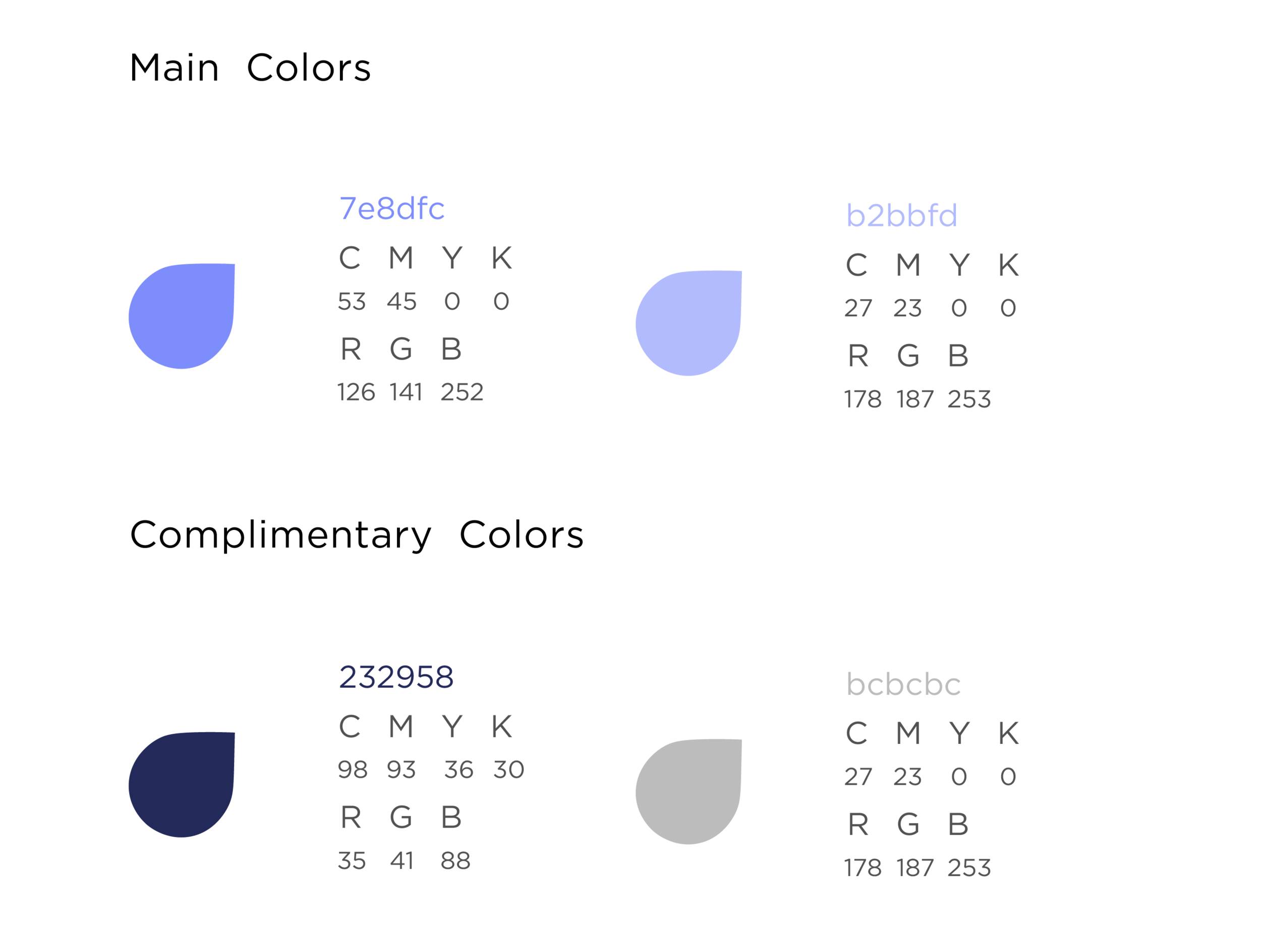
I choose a duotone combination of purple as the color choice of my logotype. Pastel purple reflects calm, romance, and whimsy.
Process
I As a designer, I believe it’s important to reflect on your process. The rejected works are the foundation behind your final product.